How to Create a Website with Video Background
Build Travel Website Using HTML CSS and JavaScript | Responsive Landing Page Website | Create a Website with Video Background | HTML & CSS
In the realm of web design, capturing users’ attention is paramount, and one effective way to achieve this is through immersive visuals and intuitive navigation. A video background website accomplishes just that by combining dynamic video elements with sleek design and functionality. Let’s dissect the HTML and TypeScript (CSS) code you’ve shared to understand how to craft an engaging travel landing page.
How to Make a Website Using HTML & CSS only
HTML CODE
<!DOCTYPE html>
<html>
<head>
<meta charset="utf-8">
<meta name="viewport" content="width=device-width, initial-scale=1">
<link rel="stylesheet" type="text/css" href="css/style.css"/>
<title>Travel Langing Page</title>
</head>
<body>
<section class="main">
<header>
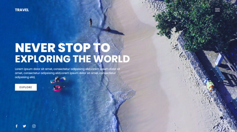
<h2 class="logo">Travel</h2>
<div class="toggle"></div>
</header>
<video src="video/back.mp4" muted loop autoplay></video>
<div class="text">
<h2>Never Stop To</h2>
<h3>Exploring The World</h3>
<p>
Lorem ipsum dolor sit amet, consectetur adipsising elid,Lorem ipsum dolor sit amet, consectetur adipsising elid,Lorem ipsum dolor sit amet, consectetur adipsising elid,
</p>
<a >Explore</a>
</div>
<div style="clear: both;"></div>
<ul class="social">
<li><a ><img src="image/facebook.png"></a></li>
<li><a ><img src="image/twitter.png"></a></li>
<li><a ><img src="image/instagram.png"></a></li>
</ul>
</section>
<div class="menu">
<ul>
<li><a href="#">Home</a></li>
<li><a href="#">News</a></li>
<li><a href="#">Destination</a></li>
<li><a href="#">Blog</a></li>
<li><a href="#">Contact</a></li>
</ul>
</div>
<script type="text/javascript">
const menuToggle = document.querySelector('.toggle');
const main = document.querySelector('.main');
menuToggle.addEventListener('click', () => {
menuToggle.classList.toggle('active');
main.classList.toggle('active');
})
</script>
</body>
</html>HTML Structure:
The HTML structure defines the layout and content of the webpage. Here’s a breakdown:
- Document Type Declaration (DOCTYPE): Specifies the HTML version used.
- Meta Tags: Define character encoding and viewport settings for responsiveness.
- Linking CSS: Links the external stylesheet (
style.css) to apply styles. - Title: Sets the title of the webpage.
- Body: Contains the main content of the webpage.
Within the body:
- Main Section (
<section class="main">): Encompasses the primary content area, including the header, video background, text content, and social media links. - Header: Contains the logo and a toggle button for the menu.
- Video Background: Utilizes a looping, muted video (
back.mp4) as the background. - Text Content: Displays captivating text and a call-to-action button for exploration.
- Social Media Links: Offers quick access to social media platforms.
How To Make A Website With Login And Register | Login Form in HTML & CSS
JavaScript (TypeScript) Code:
The TypeScript code complements the HTML structure by adding interactivity, particularly for the menu toggle functionality. Here’s a summary:
- Menu Toggle Functionality: Enables users to toggle the menu on and off.
- Event Listener: Listens for clicks on the toggle button.
- Toggle Classes: Toggles the ‘active’ class on the toggle button and main section to animate the menu.
CSS CODE
@import url('https://fonts.googleapis.com/css?family=Poppins:200,300,400,500,600,700,800,900&display=swap');
*{
  margin: 0;
  padding: 0;
  box-sizing: border-box;
  font-family: 'Poppins', sans-serif;
}
header{
  position: absolute;
  top: 0;
  left: 0;
  width: 100%;
  padding: 40px 100px;
  z-index: 1000;
  display: flex;
  justify-content: space-between;
  align-items: center;
}
header .logo{
  color: white;
  text-transform: uppercase;
  cursor: pointer;
}
.toggle{
  position: relative;
  width: 60px;
  height: 60px;
  background: url(../image/menu-open.png);
  background-repeat: no-repeat;
  background-size: 30px;
  background-position: center;
  cursor: pointer;
}
.toggle.active{
  background: url(../image/menu-close.png);
  background-repeat: no-repeat;
  background-size: 25px;
  background-position: center;
  cursor: pointer;
}
.main{
  position: absolute;
  right: 0;
  width: 100%;
  min-height: 100vh;
  padding: 100px;
  display: flex;
  justify-content: space-between;
  align-items: center;
  background: #111;
  transition: 0.5s;
  z-index: 2;
}
.main.active{right: 300px;}
.main video{
  position: absolute;
  top: 0;
  left: 0;
  width: 100%;
  height: 100%;
  object-fit: cover;
}
.text{
  position: relative;
  z-index: 10;
}
.text h2{
  font-size: 5em;
  font-weight: 800;
  color: white;
  line-height: 1em;
  text-transform: uppercase;
}
.text h3{
  font-size: 4em;
  font-weight: 700;
  color: white;
  line-height: 1em;
  text-transform: uppercase;
}
.text p{
  font-size: 1.1em;
  color: white;
  margin: 20px 0;
  font-weight: 400;
  max-width: 700px;
}
.text a{
  display: inline-block;
  font-size: 1em;
  background: white;
  padding: 10px 30px;
  text-transform: uppercase;
  text-decoration: none;
  font-weight: 500;
  margin-top: 10px;
  color: #111;
  letter-spacing: 2px;
  transition: 0.2s;
}
.text a:hover{letter-spacing: 6px;}
.social{
  position: absolute;
  z-index: 10;
  bottom: 20px;
  display: flex;
  justify-content: center;
  align-items: center;
}
.social li{list-style: none;}
.social li a{
  display: inline-block;
  margin-right: 20px;
  filter: invert(1);
  transform: scale(0.5);
  transition: 0.5s;
}
.social li a:hover{
  transform: scale(0.5) translateY(-15px);
}
.menu{
  position: absolute;
  top: 0;
  right: 0;
  width: 300px;
  height: 100%;
  display: flex;
  justify-content: center;
  align-items: center;
}
.menu ul{position: relative;}
.menu ul li{list-style: none;}
.menu ul li a{
  text-decoration: none;
  font-size: 24px;
  color: #111;
}
.menu ul li a:hover{color: #03a9f4}
@media (max-width: 991px){
  .main,
  .main header{
    padding: 40px;
  }
  .text h2{font-size: 3em}
  .text h3{font-size: 2em}
}
Styling (CSS):
The CSS styles define the visual presentation and layout of the webpage. Key components include:
- Header: Positioned at the top with a transparent background, displaying the logo and toggle button.
- Main Section: Positioned to cover the entire viewport, with a dynamic transition effect for smooth interaction.
- Text Content: Styled for readability and visual appeal, with large, bold headings and descriptive text.
- Social Media Icons: Positioned at the bottom for easy access, with hover effects for interactivity.
- Menu: Positioned on the right side for accessibility, with responsive adjustments for smaller screens.
If you have any problem to understand this code you can watch also video tutorial