How to Make Image Slider using HTML CSS only
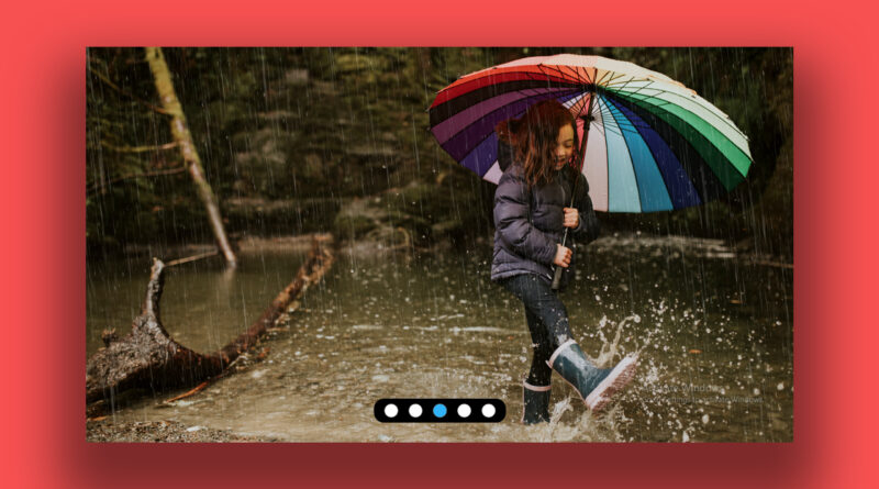
hello viewer, in this article I will teach you how to make an image slider using only html and CSS. I know you have reads lots of article related to image slider but this article is totally different to others because I will make image slider only uses of html CSS not use of JavaScript and jQuery. This slider is not autoplay slider this slider work on click pagination. then slider image is changed. in this slider I have use input radio for changing image You can see in below code. You can see I have made a main div that’s name is slider-container.
How to Make a Template Driven Form in Angular
then I create one another div inside of slider-container that’s name is pagination. It is very simple slider. easy to use anywhere in code but it is not autoplay slider. You can copy the below code. here is html css booths code.
How to create the Resume CV Design Using HTML and CSS | Resume Design | CV Design UI
HTML Code
<!DOCTYPE html>
<html>
<head>
	<title>CSS Slider</title>
	<link rel="stylesheet" type="text/css" href="css/style.css">
</head>
<body>

<div class="slider-container">

	<input type="radio" id="pag-c-1" name="pagination" value="image-1" checked>

	<img src="image/1.jpg" width="1920" height="1080">
	<input type="radio" id="pag-c-2" name="pagination" value="image-2">

	<img src="image/2.jpg" width="1920" height="1080">
	<input type="radio" id="pag-c-3" name="pagination" value="image-3">

	<img src="image/3.jpg" width="1920" height="1080">
	<input type="radio" id="pag-c-4" name="pagination" value="image-4">

	<img src="image/4.jpg" width="1920" height="1080">
	<input type="radio" id="pag-c-5" name="pagination" value="image-5">

	<img src="image/5.jpg" width="1920" height="1080">

	<div class="pagination">
		<label for="pag-c-1"></label>
		<label for="pag-c-2"></label>
		<label for="pag-c-3"></label>
		<label for="pag-c-4"></label>
		<label for="pag-c-5"></label>


	</div>


</div>


</body>
</html>
Css code
body{
  display: flex;
  flex-direction: column;
  align-items: center;
  justify-content: center;
  height: 100vh;
  background: black;
  margin: 0;
  padding:0;
}
.preloader{
  width: 1px;
  height: 1px;
  position: absolute;
  top: 0;
  left: 0;
  opacity: 0;
  z-index: -1;
}

.preloader > img{width: 0; height: 0;}
.slider-container{
  position: relative;
  width: 100%;
  height: 100%;
  display: flex;
  flex-direction: column;
  align-items: center;
  justify-content: center;
  z-index: 1;
  overflow: hidden;
}
.pagination{
  position: absolute;
  padding: 10px;
  border-radius: 20px;
  bottom: 5%;
  width: auto;
  height: auto;
  display: flex;
  flex-direction: row;
  align-items: center;
  justify-content: center;
  z-index: 7;
  background: black;
}
.slider-container > .pagination> label{
  width: 25px;
  height: 25px;
  margin: 0px 10px;
  background: white;
  border-radius: 100px;
  border: 1px solid gray;
  transition: all 0.3s ease-in-out;
}
.slider-container > .pagination > label:hover{
  background: #2fb2f8;
  cursor: pointer;
  transform: scale(1.1);
  transition: all 0.3s ease-in-out;
}
.slider-container > img{
  position: absolute;
  width: 100%;
  height: auto;
  min-height: 55%;
  object-fit: cover;
  transform: scale(2);
  opacity: 0;
  transition: all 0.5s ease-in-out;
}
.slider-container > input{display: none;}
.slider-container > input:checked + img{
  transform: scale(1);
  opacity: 1;
  transition: all 0.5s ease-in-out;
}
.slider-container
> input:nth-child(1):checked ~ .pagination > label:nth-child(1),
.slider-container
> input:nth-child(3):checked ~ .pagination > label:nth-child(2),
.slider-container
> input:nth-child(5):checked ~ .pagination > label:nth-child(3),
.slider-container
> input:nth-child(7):checked ~ .pagination > label:nth-child(4),
.slider-container
> input:nth-child(9):checked ~ .pagination > label:nth-child(5){
  background: #2fb2f8;
}
if you have any problem to understand then you watch a video tutorial