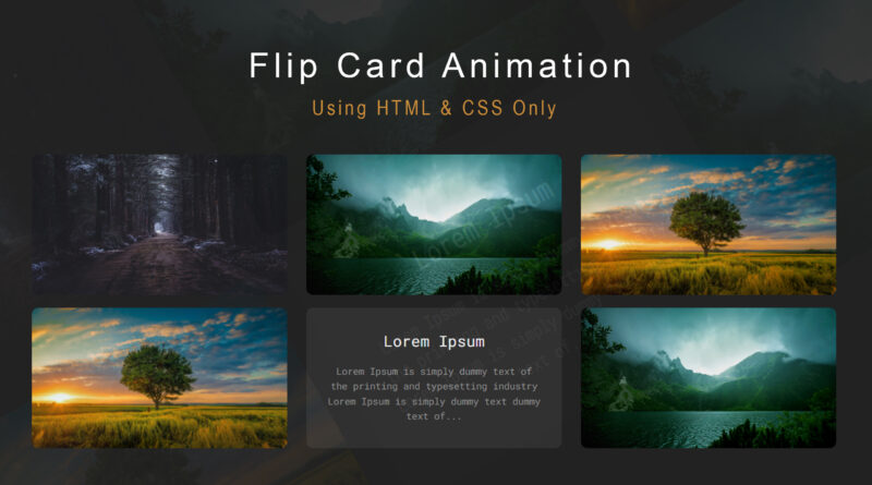
How to Make Flip card Animation Using html & CSS Only
Hello viewer, in this article I will teach you how to create flip card animation using html and CSS only. so, let’s start for
beginning first step you create a folder that name is flip card then you can make two folders inside a flip card folder. first one name is image folder and second one is CSS folder. image folder contains all images which is used in html page. And CSS folder contain all CSSS file which used in html page.
How to create a basic website using Flexbox
first step you create a html file that save in flip card folder inside
here is html source code in below you can copy this code and paste your html page.
Here is HTML Code
<!DOCTYPE html>
<html>
<head>
	<title>Card Flip</title>
	<link rel="stylesheet" type="text/css" href="css/style.css">
</head>
<body>

<br><br><br><br>
<div class="flip">
	<div class="front" style="background-image: url(./image/1.jpg)">
	</div>
	<div class="back">
		<h2>Lorem Ipsum</h2>
		<p>Lorem Ipsum is simply dummy text of the printing and typesetting industry Lorem Ipsum is simply dummy text dummy text of...</p>
	</div>
</div>

<div class="flip">
	<div class="front" style="background-image: url(./image/2.jpg)">
	</div>
	<div class="back">
		<h2>Lorem Ipsum</h2>
		<p>Lorem Ipsum is simply dummy text of the printing and typesetting industry Lorem Ipsum is simply dummy text dummy text of...</p>
	</div>
</div>

<div class="flip">
	<div class="front" style="background-image: url(./image/3.jpg)">
	</div>
	<div class="back">
		<h2>Lorem Ipsum</h2>
		<p>Lorem Ipsum is simply dummy text of the printing and typesetting industry Lorem Ipsum is simply dummy text dummy text of...</p>
	</div>
</div>

<div class="flip">
	<div class="front" style="background-image: url(./image/3.jpg)">
	</div>
	<div class="back">
		<h2>Lorem Ipsum</h2>
		<p>Lorem Ipsum is simply dummy text of the printing and typesetting industry Lorem Ipsum is simply dummy text dummy text of...</p>
	</div>
</div>

<div class="flip">
	<div class="front" style="background-image: url(./image/1.jpg)">
	</div>
	<div class="back">
		<h2>Lorem Ipsum</h2>
		<p>Lorem Ipsum is simply dummy text of the printing and typesetting industry Lorem Ipsum is simply dummy text dummy text of...</p>
	</div>
</div>

<div class="flip">
	<div class="front" style="background-image: url(./image/2.jpg)">
	</div>
	<div class="back">
		<h2>Lorem Ipsum</h2>
		<p>Lorem Ipsum is simply dummy text of the printing and typesetting industry Lorem Ipsum is simply dummy text dummy text of...</p>
	</div>
</div>


</body>
</html>
In this html code I have use lorem dummy text. if you need lorem dummy text you can find on google. otherwise, you can change content according to your need. the second step is you create a CSS file that file save on CSS folder and then you copy the code in below and paste your CSS file. then you can link your CSS file in html file. you can also check. All image is saved on image folder
How to Make a Modern Website using html css
then You see the final output in below.
Here is CSS Code
@import url("https://fonts.googleapis.com/css?family=Roboto+Mono");
*{box-sizing: border-box; font-weight: normal;}
body{
  color: #555;
  background: #222;
  text-align: center;
  font-family: "Roboto Mono";
  padding: 1em;
}
.flip{position: relative;}
.flip > .front,
.flip > .back{
  display: block;
  transition-timing-function: cubic-bezier(0.175, 0.885, 0.32, 1.275);
  transition-delay: 0.5s;
  transition-property: transform, opacity;
}
.flip > .front{transform: rotateY(0deg);}
.flip > .back{
  position: absolute;
  opacity: 0;
  top: 0px;
  left: 0px;
  width: 100%;
  height: 100%;
  transform: rotateY(-180deg);
}
.flip:hover > .front{transform: rotateY(180deg);}
.flip:hover > .back{opacity: 1; transform: rotateY(0deg);}
.flip{
  position: relative;
  display: inline-block;
  margin-right: 20px;
  margin-bottom: 1em;
  width: 400px;
}
.flip > .front,
.flip > .back{
  display: block;
  color: white;
  width: inherit;
  background-size: cover!important;
  background-position: center!important;
  height: 220px;
  padding: 1em 2em;
  background: #313131;
  border-radius: 10px;
}
.flip > .front p,
.flip > .back p{
  font-size: 0.9125rem;
  line-height: 160%;
  color: #999;
}
Watch a video tutorial how to create a CSS flip card Animation