
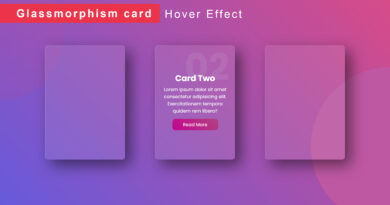
How To Make Card Hover Effect Using HTML CSS
Welcome To The M-SoftTech Blog. In This Blog, We Learn How To Create A Card Hover Effect With Border Animation Effect. We Use HTML And CSS For This Card Hover Effect.
Cards are very important part for any website. It is used to display some important information in short to viewers. So, in this article we will create a responsive card with amazing hover effect using HTML and CSS. By using HTML we will design the basic structure of the card and then by using the properties of CSS we can create the hover animation effect.
I Hope You Enjoy Our Blog So Let’s Start With A Basic HTML Structure For Creating Card.
<!DOCTYPE html> <html> <head> <title>Animated Product Card</title> <link href="https://fonts.googleapis.com/css2?family=Lato&display=swap" rel="stylesheet"> <link rel="stylesheet" href="https://cdnjs.cloudflare.com/ajax/libs/font-awesome/5.15.3/css/all.min.css"> <link rel="stylesheet" type="text/css" href="css/style.css"/> </head> <body> <div class="cardBox"> <div class="card"> <div class="content"> <div class="back"> <h2>Virat Kohli</h2> <h3>10</h3> <h3>PSG | IND</h3> <img class="tem-img" src="image/t1.jpg"> <img class="tem-img" src="image/t2.jpg"><br/> <p class="des"> Lorem ipsum dolor, sit amet consectetur adipiscing elit. Lorem ipsum dolor, sit amet consectetur adipiscing elit. Lorem ipsum dolor, sit amet consectetur adipiscing elit. </p> <ul class="social-icon"> <li><a href=""><i class="fab fa-facebook"></i></a></li> <li><a href=""><i class="fab fa-instagram"></i></a></li> <li><a href=""><i class="fab fa-twitter"></i></a></li> </ul> </div> </div> </div> </div> </body> </html>
CSS Code For Card Hover Effect
@import url("https://fonts.googleapis.com/css2?family=Poppins:wght@400;500;600;700;800;900&display=swap");
*{
  margin: 0px;
  padding: 0px;
  box-sizing: border-box;
  font-family: "Poppins", sans-serif;
}
body{
  width: 100%;
  min-height: 100vh;
  display: grid;
  place-items:center;
  background: #4394e1;
}
.cardBox{
  width: 300px;
  height: 400px;
  position: relative;
  display: grid;
  place-items:center;
  overflow: hidden;
  border-radius: 20px;
  background: url(../image/3.jpg);
}
.card{
  position: absolute;
  width: 95%;
  height: 95%;
  background: url(../image/3.jpg);
  background-size: cover;
  border-radius: 20px;
  z-index: 5;
  display: flex;
  justify-content: center;
  align-items: center;
  flex-direction: column;
  text-align: center;
  overflow: hidden;
  padding: 20px;
  cursor: pointer;
}
.card .content{
  transform: translateY(100%);
  opacity: 0;
  color: #00838d;
  transition: 0.6s ease-in-out;
}
.card:hover .content{
  transform: translateY(0);
  opacity: 1;
  background: white;
  padding: 64px 34px;
  width: 117%;
}
.cardBox::before{
  content: "";
  position:absolute;
  width: 40%;
  height: 150%;
  background: linear-gradient(to right, #f3f8f9, #a6d7e4, #4394e1);
  transform-origin: center;
  animation: lineanimation 5s linear infinite;
}
.card .content .back h3{font-size: 15px; letter-spacing: 2px;}
.card .content .back .tem-img{border-radius: 100%;}
.card .content .back .des{font-size: 13px; padding: 20px 0px;}
.card .content .back .social-icon{list-style: none; margin: 0px;padding: 0px;}
.card .content .back .social-icon li{display: inline-block;}
.card .content .back .social-icon li a{
  display: block;
  background: #00838d;
  color: white;
  width: 40px;
  height: 40px;
  text-align: center;
  line-height: 40px;
  border-radius: 100%;

}
@keyframes lineanimation{
  0%{transform: rotate(0);}
  100%{transform: rotate(360deg);}
}
If you enjoyed reading this post and have found it useful for you, then please give a share with your friends, and follow me to get updates on my upcoming posts.
if you have any confusion Comment below or you can contact us by filling out our contact us.
YOU MIGHT ALSO LIKE
How To Create A Website Using HTML And CSS Step By Step Website Tutorial
How to make a dashboard Design Using html CSS
If you have any problem to understand this code you can watch also video tutorial