How to Make Glassmorphism Card Hover Effects
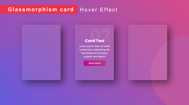
Hello, viewer in this article I will teach you how to create Glassmorphism Card Hover Effects Using HTML and CSS only. If you don’t know about glassmorphism design so it’s not any big issue, I will explain you in detail about glassmorphism design. Glassmorphism is a new design trend that is currently very popular. Essentially, the main aspect of this trend is a semi-transparent background, with a sublime shadow and border.
How to Make a Landing page Website using html CSS
Create a Responsive Website Using Flexbox | Flexbox Website
so, let’s start practical of this project First things first, let’s create a basic HTML file. after then you copy the code in below. and paste the code in your html document. I used to google fonts for attractive font style you can also use google fonts according to your need. linked a google font file in html head tag and linked CSS file you can see on code
HTML Source code
<!DOCTYPE html>
<html>
<head>
	<title>Glassmorphism card</title>
	<link rel="stylesheet" type="text/css" href="css/style.css">
</head>
<body>

<div class="container">
	<div class="card">
		<div class="content">
			<h2>01</h2>
			<h3>Card One</h3>
			<p>Lorem Ipsum dolor sit amet consectetur adipicing elit.Lorem Ipsum dolor sit amet consectetur</p>
			<a href="">Read More</a>
		</div>
	</div>
	<div class="card">
		<div class="content">
			<h2>02</h2>
			<h3>Card Two</h3>
			<p>Lorem Ipsum dolor sit amet consectetur adipicing elit.Lorem Ipsum dolor sit amet consectetur</p>
			<a href="">Read More</a>
		</div>
	</div>
	<div class="card">
		<div class="content">
			<h2>03</h2>
			<h3>Card Three</h3>
			<p>Lorem Ipsum dolor sit amet consectetur adipicing elit.Lorem Ipsum dolor sit amet consectetur</p>
			<a href="">Read More</a>
		</div>
	</div>
</div>


</body>
</html>
And now you can copy the CSS code and paste in your CSS file. then see the file output of your page you can make sure your CSS file link properly or not then see the output.
Here is CSS Code
@import url("https://fonts.googleapis.com/css2?family=Poppins:wght@200;300;400;500;600;700;800;900&display=swap");
*{margin: 0; padding: 0; box-sizing: border-box; font-family: "Poppins", sans-serif;}
body{
  display: flex;
  align-items: center;
  justify-content: center;
  height: 100vh;
  width: 100vw;
  background:linear-gradient(45deg, #655add, #d84b97);
}
body::before{
  position: absolute;
  top: 0;
  left: 0;
  content: "";
  height: 100%;
  width: 100%;
  background: linear-gradient(45deg, #655add, #d84b87);
  clip-path:circle(25% at right 70%);
}
body::after{
  position: absolute;
  top: 0;
  left: 0;
  content: "";
  height: 100%;
  width: 100%;
  background: linear-gradient(#c14e993b, #90654b4f);
  clip-path:circle(20% at left 20%);

}
.container{
  display: flex;
  align-items: center;
  justify-content: space-evenly;
  min-width: 1200px;
}
.container .card{
  position: relative;
  padding: 20px;
  margin: 30px;
  height: 400px;
  width: 280px;
  background: rgb(255 255 255 / 10%);
  border-top:1px solid rgba(255, 255, 255, 0.3);
  border-left: 1px solid rgba(255, 255, 255, 0.3);
  border-radius: 10px;
  z-index: 1;
  box-shadow: 20px 20px 50px rgba(0, 0, 0, 0.5);
}
.container .card .content{
  display: flex;
  flex-direction: column;
  align-items: center;
  justify-content: center;
  height: 100%;
  width: 100%;
  color: white;
  text-align: center;
  transform: translateY(100px);
  opacity: 0;
  transition: 0.5s;
}
.container .card:hover .content{
  transform: translateY(0px); opacity: 1;
}
.container .card .content h2{
  position: absolute;
  top: -40px;
  right: 0;
  color: rgba(255, 255, 255, 0.1);
  font-size: 8em;
}
.container .card .content h3{font-size: 1.8em; margin: 5px;}
.container .card .content a{
  display: flex;
  align-items: center;
  justify-content: center;
  background: linear-gradient(45deg,  #c3038e, #b2427ef2);
  color: white;
  text-decoration: none;
  border-radius: 10px;
  height: 40px;
  width: 160px;
  margin: 15px;
}
Watch a video tutorial how to create Glassmorphism Card Hover Effects


