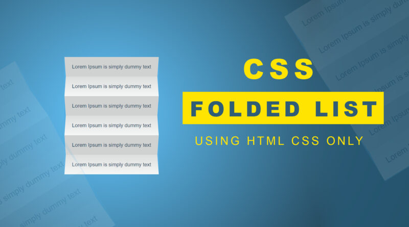
How to make a folded list using html css only
Hello viewer, welcome to m-softttech. Today I will teach you how to create a simple folded list using html CSS only. you heaved seen lots of menu and list style using of ul li. but in this article, I will teach you how to create a folded list design using only html CSS so let’s start our article first thing you need to create a ul li list. ul li is generally used for creating a website menu. you heaved seen lots of website in internet they create own website menu using html css.
How to Make css car animation using html css
Here is my html code
<!DOCTYPE html>
<html>
<head>
	<meta charset="utf-8">
	<meta name="viewport" content="width=device-width, initial-scale=1">
	<link rel="stylesheet" type="text/css" href="css/style.css">
	<title></title>
</head>
<body>

<section class="flex">

	<ul class="ul">
		<li class="li">
			<span class="list__item-text">Lorem Ipsum is simply dummy text</span>
		</li>
		<li class="li">
			<span class="list__item-text">Lorem Ipsum is simply dummy text</span>
		</li>
		<li class="li">
			<span class="list__item-text">Lorem Ipsum is simply dummy text</span>
		</li>
		<li class="li">
			<span class="list__item-text">Lorem Ipsum is simply dummy text</span>
		</li>
		<li class="li">
			<span class="list__item-text">Lorem Ipsum is simply dummy text</span>
		</li>
		<li class="li">
			<span class="list__item-text">Lorem Ipsum is simply dummy text</span>
		</li>
	</ul>
</section>

</body>
</html>
And here is my css file code
CSS GRID GALLERY ANIMATION | PURE CSS ANIMATION
body {
  color: #1f4e5f;
   font-family: "Lato", sans-serif;
  background-image: radial-gradient(#2ab7eb 10%, #000000 100%);
  background-size: 2000px 2000px;
  background-position: center;
}
.flex {
  position: relative;
  height: 100vh;
  display: flex;
  flex-direction: column;
  align-items: center;
  justify-content: center;
}
.ul {
  font-size: 1.15rem;
}
.li {
  position: relative;
  padding: 1.5em;
  line-height: 1;
  perspective: 150px;
  background-color: #f4f7f7;
  white-space: nowrap;
  list-style: none;
}
.li::before, .li::after {
  position: absolute;
  top: 0;
  display: block;
  height: 0;
  width: 0;
  content: "";
  border: 0 solid transparent;
}
.li::after {
  right: 0;
}
.li::before {
  left: 0;
}
.li:nth-child(even) {
  background-image: linear-gradient(to bottom, rgba(0, 0, 0, 0.1) 0%, transparent 100%);
}
.li:nth-child(even)::before, .li:nth-child(even)::after {
  border-top-color: #1ab1e7;
  border-top-width: 4em;
}
.li:nth-child(even)::before {
  border-right-width: 5px;
}
.li:nth-child(even)::after {
  border-left-width: 5px;
}
.li:nth-child(odd) {
  background-image: linear-gradient(to bottom, rgba(0, 0, 0, 0.15) 0%, rgba(0, 0, 0, 0.15) 100%);
}
.li:nth-child(odd)::before, .li:nth-child(odd)::after {
  border-bottom-color: #1ab1e7;
  border-bottom-width: 4em;
}
.li:nth-child(odd)::before {
  border-right-width: 5px;
}
.li:nth-child(odd)::after {
  border-left-width: 5px;
}
.list__item-text {
  display: inline-block;
}
.list__item:nth-child(odd) .list__item-text {
  transform: rotateX(-7deg);
}
.list__item:nth-child(even) .list__item-text {
  transform: rotateX(7deg);
}
If you have facing any problem to understand this code you can also watch this video tutorial