How to Make css car animation using html css
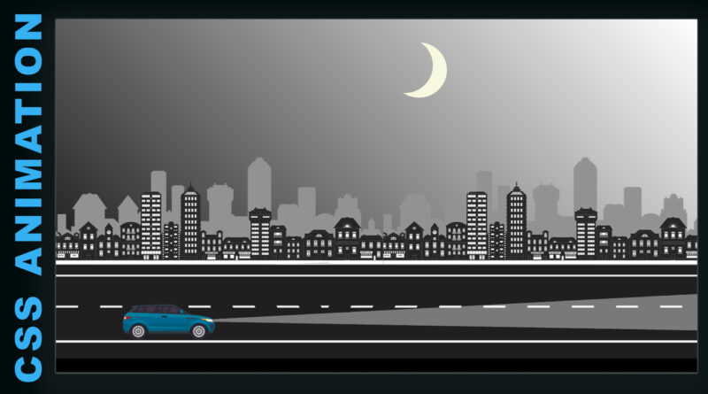
Hello viewer, in this article I will teach you how to create CSS animation effect. you can see in this project. I have created a road moving animation and also moving building and moving car. in this project I have use total four images one is buildings image and second one is road image and third one is car image and forth one is car wheel images.
How to Make a Modern Website using html css
Moon I have created on CSS. and car headlight I have created on CSS. copy the code in below
Create CRM UI Design All page Using HTML & CSS Only | CRM Design | CRM UI Design
HTML Code
<!DOCTYPE html>
	<html>
	<head>
	<title>Loader</title>
	<meta name="viewport" content="width=device-width, initial-scale=1">
	<link rel="stylesheet" type="text/css" href="css/style.css">

	</head>
	<body>

	<html>
	<body>
	<div id="main">

	<div id="moon"></div>
	<div id="sky"></div>
	<div id="road"></div>
	<div class="lamp"></div>
	<div class="car"></div>
	</div>
	</body>

	</html>

	</body>
	</html>
CSS Code
html{
    font-size:20px;
    margin:0;
    background:linear-gradient(45deg, black, #92929200);
    height: 100vh;
    }
  body{margin: 0px;overflow: hidden;}
#main{margin-top: 12em;}
#road{
    background: url('../image/building.png');
    height: 253px;
    width: 1379px;
    z-index: -10;
    top: 14em;
    background-position: 0px 0px;
    background-repeat: repeat-x;
    animation: build 100s linear infinite;
    position: absolute;
    }


   @keyframes  build {
        from { background-position: 0 0; }
        to { background-position: 100% 0; }
    }

#moon {
    width: 6em;
    height: 6em;
    border-radius: 50%;
    box-shadow: 30px 10px 0 #F7F8E0;
    margin-top: -8em;
    margin-left: 50%;
    position: absolute;
    z-index: -19;
    }

#sky{
  height: 240px;
    width: 100%;
    background: url(../image/road.png);
    bottom:0px;
    background-size: auto 245px;
     background-position: 0px 0px;
    background-repeat: repeat-x;
    animation: build 15s linear infinite;
    position: absolute;

    }
    .car{
      width: 200px;
      height: 100px;
      background: url(../image/car.png);
    left: 140px;
    bottom: 70px;
    position: absolute;
    }
.car:after{
  content: '';
  height: 35px;
  width: 36px;
  background: url(../image/wheel-1.png);
  position: absolute;
  top: 63px;
    left: 18px;
    animation: rotateWheel 0.7s infinite linear;
}
.car:before{
  content: '';
  height: 35px;
  width: 36px;
  background: url(../image/wheel-1.png);
  position: absolute;
  top: 63px;
    left: 147px;
    animation: rotateWheel 0.7s infinite linear;
}

     @keyframes rotateWheel {
  from {transform: rotate(0deg);}
  to {transform: rotate(360deg);}
}

.lamp {
  content: "";
  display: block;
  position: absolute;
  width: 60px;
  bottom: 98px;
  left: 303px;
  transform: rotateZ(269deg);
  border-bottom: 30px solid transparent;
  border-radius: 50%;
  z-index: 2;
}


.lamp:after {
  content: "";
  display: block;
  position: absolute;
      width: 10px;
    height: 18px;
    top: -163px;
    left: -134px;
  border-top: 150px solid transparent;
  border-bottom: 2180px solid rgba(255, 255, 255, .4);
  border-left: 160px solid transparent;
  border-right: 160px solid transparent;
  z-index: 1;
  transform: rotateY(61deg);
}
How to create css car animation using html & css watch a video tutorials