
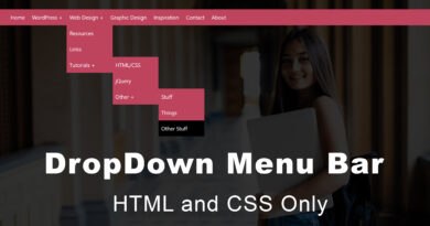
How to make Vertical Animated Navbar Using HTML & CSS
Hello viewer, in today article in will teach you how to make a vertical animated navbar. I have already post make another article related to dashboard navbar. you can also read this I will share the link in below
How to make a navbar menu using html css
in this article you can see that I will used hamburger for open and close navbar menu. you can see in code. first step we create two file one is html and second one CSS file. I am inserting jQuery code in below of html document not create a new file. if you want new file, you can make it. add bootstrap cdn file link attached in your html document head section. and also link jQuery file. I make a div that’s class name is box-menu. it is main div in our project. all div are inside of box-menu div. you can see this in code. and then we create a wrapper div and menu div. hamburger menu create on help of span tag.
HTML Source code
<html lang="en">
<head>
	<meta charset="UTF-8">
	<title>Vertical navbar </title>
	<link rel="stylesheet" href="https://cdnjs.cloudflare.com/ajax/libs/normalize/4.2.0/normalize.min.css">
	<link rel="stylesheet" href="https://maxcdn.bootstrapcdn.com/font-awesome/4.6.3/css/font-awesome.min.css">
	<link rel="stylesheet" href="css/style.css">
</head>
<body>

	<div class="box-menu">
		<div class="wrapper">
			<div class="hamburger">
				<span></span>
				<span></span>
				<span></span>
				<span></span>
			</div>
		</div>
		<div class="menu">
			<a href="#" class="active"><span class="icon fa fa-info-circle"></span> <span class="text">About Us</span></a>
			<a href="#"><span class="icon fa fa-suitcase"></span> <span class="text">Portfolio</span></a>
			<a href="#"><span class="icon fa fa-shopping-basket"></span> <span class="text">Store</span></a>
			<a href="#"><span class="icon fa fa-phone"></span> <span class="text">Contacts</span></a>

		</div>
	</div>


	<script src="https://code.jquery.com/jquery-2.2.4.min.js"></script>
	<script type="text/javascript">
		$(function(){
			$('.box-menu .wrapper').on('click', function(){
				$('.box-menu').toggleClass('full-menu');
				$('.hamburger').toggleClass('active');
			});
			$('a').on('click', function(){
				$(this).siblings('a').removeClass('active');
				$(this).addClass('active');
			});
		});
	</script>

</body>
</html>
CSS source code
Creative CSS Animation Effects CSS3 Neomorphism
@import 'https://fonts.googleapis.com/css?family=Ubuntu';
body{background: #050d4b;}
.box-menu{
	position: absolute;
	left: 50px;
	top: 50px;
	cursor: pointer;
	background: #eba440;
	width: 60px;
	height: 60px;
	box-shadow: 2px 3px 5px rgba(0, 0, 0, .3);
	border-radius: 60px;
	transition:height .4s;
}
.full-menu{height: 300px;}
.wrapper{
	position: relative;
	width: 60px;
	height: 60px;
}
.hamburger{
	position: absolute;
	left: 22px;
	top: 22px;
	width: 16px;
	height: 16px;
}
.hamburger span{
	position: absolute;
	display: inline-block;
	height: 2px;
	width: 100%;
	background: #050d4b;
	border-radius: 10px;
	transition: all .3s;
}
.hamburger span:nth-child(1){top: 3px;}
.hamburger span:nth-child(2){top: 8px;}
.hamburger span:nth-child(3){top: 8px;}
.hamburger span:nth-child(4){top: 13px;}

.hamburger.active span:nth-child(1){width: 0; margin-left: 8px;}
.hamburger.active span:nth-child(2){transform: rotate(45deg);}
.hamburger.active span:nth-child(3){transform: rotate(-45deg);}
.hamburger.active span:nth-child(4){width: 0; margin-left: 8px;}
.menu{position: relative; left: -9999px;}
.menu a{
	white-space: nowrap;
	position: relative;
	display: inline-block;
	color: #333;
	text-decoration: none;
	width: 150px;
	height: 58px;
	line-height: 58px;
	font-family: Ubuntu;
}
.menu a::after{
	content: '';
	position: absolute;
	left: 50px;
	width: 15px;
	background: #e1a754;
	transition: height .3s, top .3s;
	transform: rotateZ(43deg);
}
.menu a.active::after{top: 19px; height: 20px;}
.menu a span{opacity: 0; display: inline-block; font-size: 14px;}
.menu a span.icon{
	transform: scale(.5);
	color: #050d4b;
	font-size: 18px;
	display: inline-block;
	width: 60px;
	text-align: center;
	transition: transform .3s;
}
.menu a span.text{
	text-shadow: 1px 1px 0px rgba(0, 0, 0, 0.3);
	opacity: 0;
	margin-left: 40px;
	color: #eba440;
	transition: margin .3s, opacity .3s, transform .3s;
}
.full-menu .menu{left: 0;}
.full-menu .menu a:hover span{opacity: 1;}
.full-menu .menu a span {opacity: .8;}
.full-menu .menu a span.icon{transform: scale(1.1);}
.full-menu .menu a span.text{margin-left: 25px;}
.full-menu .menu a:hover span.text {transform: translateX(5px); transition-delay: 0s;}

.menu a:nth-child(1) span{transition: all .5s .1s, opacity .5s 0s, transform .5s 0s;}
.menu a:nth-child(2) span{transition: all .5s .15s, opacity .5s 0s, transform .5s 0s;}
.menu a:nth-child(3) span{transition: all .5s .2s, opacity .5s 0s, transform .5s 0s;}
.menu a:nth-child(4) span{transition: all .5s .25s, opacity .5s 0s, transform .5s 0s;}
if you have any problem to understand this article, please watch video tutorial also