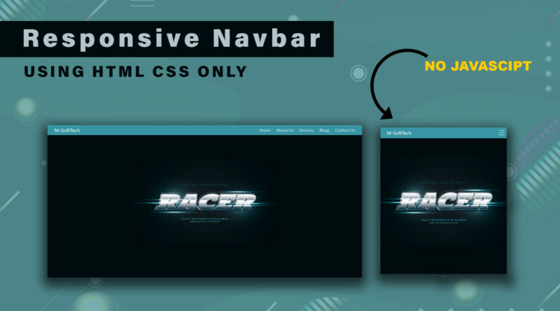
How to Make a Responsive Navbar Using HTML CSS Only
Hello viewer, in this article I will teach you how to make a responsive navbar. you have already seen lots of articles related for responsive navbar but the difference in this article I will told you. the difference is all article create a responsive navbar using JavaScript and jQuery but I will teach you how to create a responsive navbar without using of JavaScript and jQuery. as you know that navbar is important part of web page without navbar web page is not complete.
What is use of navbar in website?
How to add a google map in a website
navbar play important role on our website so let’s understand what is role of navbar in our website. navbar contain our website pages link suppose i have created five pages website. I have created a navbar on header tag. that navbar contain my all five-page link. when user come my website that see navbar. the help of navbar user goes to our all pages in website.
so, let’s start the practical of how to create responsive navbar using of html CSS
How to Create a Resume | resume kaise banaye | Create a Resume using HTML CSS | cv html css
First step you can copy the below code in your html document
HTML Code
<!DOCTYPE html>
<html>
<head>
	<title>Responsive Navbar</title>
	<meta name="viewport" content="width=device-width, initial-scale=1.0">
	<link rel="stylesheet" type="text/css" href="css/style.css">
</head>
<body>

<div class="nav">
  <input type="checkbox" id="nav-check">
  <div class="nav-header">
    <div class="nav-title">
      M-SoftTech
    </div>
  </div>
  <div class="nav-btn">
    <label for="nav-check">
      <span></span>
      <span></span>
      <span></span>
    </label>
  </div>

  <div class="nav-links">
    <a href="">Home</a>
    <a href="">About Us</a>
    <a href="">Services</a>
    <a href="">Blogs</a>
    <a href="">Contact Us</a>
  </div>
</div>

</body>
</html>
And then copy the CSS code in below
CSS Code
* {box-sizing: border-box;}
body {margin: 0px;font-family:system-ui;
background: url(../image/back.jpg) #000b0d;
background-repeat: no-repeat;
height: 100vh;
background-position: center center;

}
.nav {
  height: 50px;
  width: 100%;
  padding: 0px 20px;
  background-color: #3795a3;
  position: relative;
}
.nav > .nav-header {display: inline;}
.nav > .nav-header > .nav-title {
  display: inline-block;
  font-size: 22px;
  color: #fff;
  padding: 10px 10px 10px 10px;
}
.nav > .nav-btn {display: none;}
.nav > .nav-links {display: inline;float: right;font-size: 18px;}
.nav > .nav-links > a {
  display: inline-block;
  padding: 13px 10px 13px 10px;
  text-decoration: none;
  color: #efefef;
}
.nav > .nav-links > a:hover {background-color: rgba(0, 0, 0, 0.3);}
.nav > #nav-check {display: none;}
@media (max-width:600px) {
  .nav > .nav-btn {
    display: inline-block;
    position: absolute;
    right: 0px;
    top: 0px;
  }
  .nav > .nav-btn > label {
    display: inline-block;
    width: 50px;
    height: 50px;
    padding: 13px;
  }
  .nav > .nav-btn > label:hover,.nav  #nav-check:checked ~ .nav-btn > label {
    background-color: rgba(0, 0, 0, 0.3);
  }
  .nav > .nav-btn > label > span {
    display: block;
    width: 25px;
    height: 10px;
    border-top: 2px solid #eee;
  }
  .nav > .nav-links {
    position: absolute;
    display: block;
    width: 100%;
    background-color: #266872;
    height: 0px;
    transition: all 0.3s ease-in;
    overflow-y: hidden;
    top: 50px;
    left: 0px;
  }
  .nav > .nav-links > a {display: block;width: 100%;}
  .nav > #nav-check:not(:checked) ~ .nav-links {height: 0px;}
  .nav > #nav-check:checked ~ .nav-links {
    height: calc(100vh - 50px);
    overflow-y: auto;
  }
}
You can see this entire code. i am not used any JavaScript and jQuery to create a responsive navbar. If this video is helpful for you then please subscribe my YouTube channel also. Thank You so much for reading this article.
Watch a Video tutorial how to make responsive navbar using HTML CSS only