How To make Animated Login Form Using HTML CSS
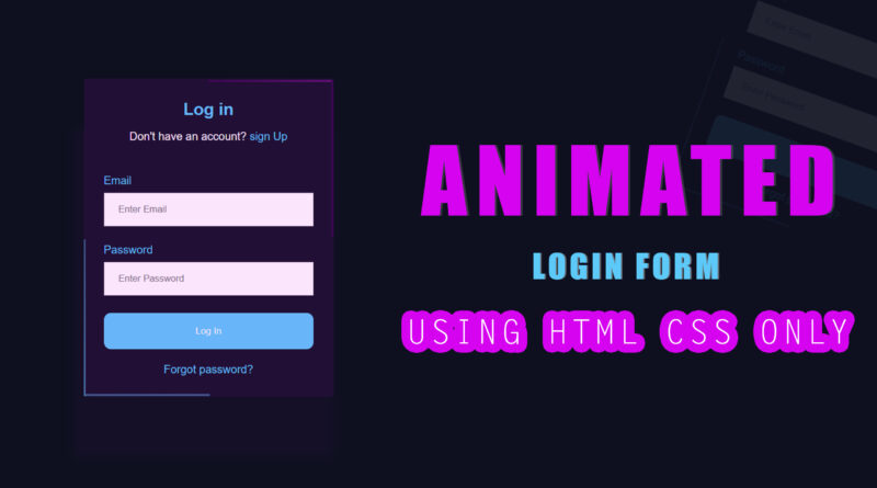
Hello viewer, welcome to M-Softech. In today article I have teach how to make a animated form using html CSS. it is border animation they surrounding login form outside area. animation line are moving one direction to other direction. I used two different color border line you can see that. so first question in your mind how to make this thing only using of html CSS. so don’t worry about this things because i will explain you in details. how to make border animation using of html CSS only. and also I will share source with you.
What you will need:
- Text Editor such as notepad++ or Sublime Text Editor – Choose a text editor you prefer to write code in
- Basic knowledge of HTML,CSS
first step we make div. that div is main div over html document. and also add a class on that div. then we make four span. that four span create border animation effect for our login form.
I will using CSS keyframes animation in do this thing. basically In CSS, keyframes are used for animations. It gives you more control over the animation you want to perform. The animation is created by gradually changing from one style to another. You can change the CSS styles as many times as you want.
Syntax:
@keyframes [name]{

      from{

        [styles];

      }

      to{

        [styles];

}- The [name] value defines the name of the animation. You can name it anything you want.
- The [styles] value defines the CSS style properties.
Keep in mind that these do not have any selectors on them. They are at the root of the CSS page.
Let’s start with the HTML markup for the Animated Login Form.
<!DOCTYPE html>
<html>
<head>
	<title>Animated Border Login Form </title>
	<link rel="stylesheet" type="text/css" href="css/style.css"/>
</head>
<body>

<div class="main">
	<span></span>
	<span></span>
	<span></span>
	<span></span>
	<div class="card">
		<form>
			<h2 class="title">Log in</h2>
			<p class="subtitle">Don't have an account? <a href="#">sign Up</a></p>
			<br/>
			<div class="email-login">
				<label>Email</label>
				<input type="text" placeholder="Enter Email">
				<label>Password</label>
				<input type="password" placeholder="Enter Password">
			</div>
			<button class="cta-btn">
				Log In
			</button>
			<a class="forgot-pass" href="#">Forgot password?</a>
		</form>
	</div>
</div>


</body>
</html>
Let’s start with the CSS for the Animated Login Form.
body{
	margin: 0;
	background: #0d1021;
	height: 100vh;
	display: grid;
	place-items:center;
}
:root{
	--font-color:#00ccfe;
}
.main{
	position: relative;
	overflow: hidden;
	border-radius: 50px 0px 50px 0px;
}
.main span:nth-child(1){
	position: absolute;
	top: 0;
	right: 0;
width: 100%;
	height: 3px;
	background: linear-gradient(to right, #2e0541, #870895);
	animation: animate1 2s linear infinite;
}
@keyframes animate1{
	0%{transform: translateX(-100%);}
	100%{transform: translateX(100%);}
}
.main span:nth-child(2){
	position: absolute;
	top: 0;
	right: 0;
height: 100%;
	width: 3px;
	background: linear-gradient(to bottom, #2e0541, #2e0541);
	animation: animate2 2s linear infinite;
	animation-delay: 1s;
}
@keyframes animate2{
	0%{transform: translateY(-100%);}
	100%{transform: translateY(100%);}
}
.main span:nth-child(3){
	position: absolute;
	bottom: 0;
	right: 0;
	height: 3px;
	width: 100%;
	background: linear-gradient(to left, #215b83, #0a5b78);
	animation: animate3 2s linear infinite;

}
@keyframes animate3{
	0%{transform: translateX(100%);}
	100%{transform: translateX(-100%);}
}
.main span:nth-child(4){
	position: absolute;
	top: 0;
	left: 0;
	height: 100%;
	width: 3px;
	background: linear-gradient(to top, #009fc9, #0a5b78);
	animation: animate4 2s linear infinite;
	animation-delay: 1s;

}
@keyframes animate4{
	0%{transform: translateY(100%);}
	100%{transform: translateY(-100%);}
}
a{text-decoration: none; color: var(--font-color);}
.card{
	font-family: sans-serif;
	width: 300px;
	border-radius: 50px 0px 50px 0px;
	background-color: transparent;
	padding: 1.8rem;
}
.title{
	text-align: center;
	color: var(--font-color);
	margin: 0;
}
.subtitle{text-align: center; color: white}
.email-login{display: flex; flex-direction: column;}
.email-login label{color: var(--font-color); margin-top: 10px;}
input[type="text"],
input[type="password"]{
	padding: 15px 20px;
	margin-top: 8px;
	margin-bottom: 15px;
	border: 1px solid #ccc;
	box-sizing: border-box;
}
.cta-btn{
	background-color:var(--font-color);
	color: white;
	padding: 18px 20px;
	margin-top: 10px;
	margin-bottom: 20px;
	width: 100%;
	border-radius: 10px;
	border: none;
}
.forgot-pass{
	text-align: center;
	display: block;
}
If you enjoyed reading this post and have found it useful for you, then please give a share with your friends, and follow me to get updates on my upcoming posts.
if you have any confusion Comment below or you can contact us by filling out our contact us.
YOU MIGHT ALSO LIKE
How To Make a Responsive Flexbox Website Layout
How to Create Responsive Resume Website using HTML and CSS | Resume CV design in HTML CSS
If you have any problem to understand this code you can watch also video tutorial


