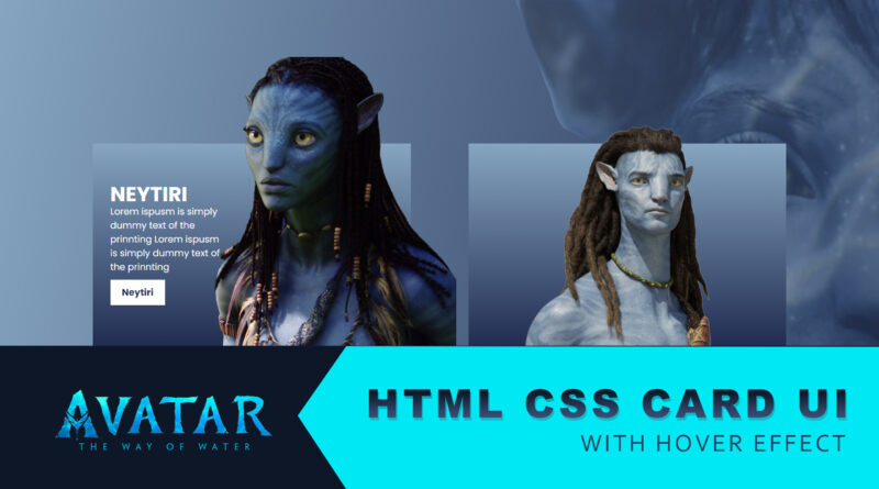
How to make Movie Card UI Design in Html & CSS
Hello, viewer welcome to M-SoftTech. In Today Artical How to Make a card UI Design with CSS Hover Effect. we’ll learn how to Create a Creative Avatar Movie Card UI Design in HTML & CSS.
We create a unique and very useful Movie card Hover Effects. You can use this thing on inside your website Pages. If You add that things in your website then your website looks amazing. I will share all source code with you.
As you all know Movie cards used to display a picture of an item that linked in some way to related our Movie. for example, the Movies we sale. It allows someone to quickly recognize a particular Moive of interest to them from a group, for example in search results.
In this article, on the webpage, here is only a Movie image which will help o show your Movie. In the product customize container, there is a Movie name, Character name, Character About, and buttons. There are only three-color options.
I found that sometimes when we work at some different websites, we want to show a lot of information in a small container. So how can we keep a presentation card usable and beautiful when you have too much information. With the modern CSS3 with Cool Hover Effects transitions, we can make the web even more interesting.
HTML Source Code
<!DOCTYPE html>
<html>
<head>
	<title>Card Effect</title>
	<link rel="stylesheet" type="text/css" href="css/style.css">
</head>
<body>


	<body>

    <div class="container">
        <div class="card">
            <div class="content">
                <h2>Neytiri</h2>
                <p>
                    Lorem Ipsum is simply dummy text of the printing and typesetting industry. Lorem Ipsum has been the
                </p>
                <a href="#">Neytiri</a>
            </div>
            <img src="image/av1.png">
        </div>
        <div class="card">
            <div class="content">
                <h2>Jake Sully</h2>
                <p>
                    Lorem Ipsum is simply dummy text of the printing and typesetting industry. Lorem Ipsum has been the
                </p>
                <a href="#">Jake Sully</a>
            </div>
            <img src="image/av2.png">
        </div>
    </div>

</body>


</body>
</html>
CSS Source Code
@import url('https://fonts.googleapis.com/css2?family=Poppins:wght@300;400;500;600;700;800;900&display=swap');

*{
    margin: 0;
    padding: 0;
    box-sizing: border-box;

}

body{
    display: flex;
    justify-content: center;
    align-items: center;
    min-height: 100vh;
    background: url(../image/back.png), linear-gradient(180deg, #7ea6c3, #1d2d54);
    background-size: 100%;
}

.container{
    position: relative;
    display: flex;
    justify-content: center;
    align-items: center;
}

.container .card{
    position: relative;
    width: 550px;
    height: 350px;
    margin: 50px;
    display: flex;
    transition: 0.5s;
    justify-content: flex-start;
    align-items: center;
    background: linear-gradient(180deg, #7ea6c3, #1d2d54);
}

.container .card img{
    position: absolute;
    bottom: 0;
    left: 50%;
    transform: translateX(-50%);
    height: 400px;
    transition: 0.5s;
}

.container .card:hover img{
    left: 73%;
    height: 500px;
}

.container .card .content{
    position: relative;
    width: 40%;
    left: 20%;
    padding: 20px 20px 20px 10px;
    opacity: 0;
    visibility: hidden;
    transition: 0.5s;
}

.container .card:hover .content{
    left: 20px;
    opacity: 1;
    visibility: visible;
}

.container .card .content h2
{
    color: #fff;
    text-transform: uppercase;
    font-size: 2.2em;
    line-height: 1em;

}
.container .card .content p{
    color: #fff;
}

.container .card .content a{
    position: relative;
    color: #263357;
    background: white;
    display: inline-block;
    padding: 10px 20px;
    margin-top: 10px;
    text-decoration: none;
    font-weight: 700;
}
If you enjoyed reading this post and have found it useful for you, then please give a share with your friends, and follow me to get updates on my upcoming posts.
if you have any confusion Comment below or you can contact us by filling out our contact us.
YOU MIGHT ALSO LIKE
How To Make a Responsive Flexbox Website Layout
How To Make Website Using HTML & CSS | Full Responsive Website Design Step by Step
If you have any problem to understand this code you can watch also video tutorial